SAVE R 700,00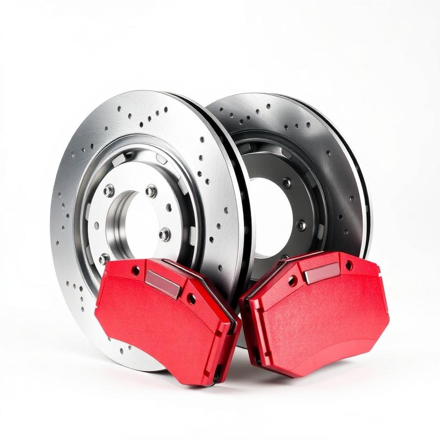
Free nationwide delivery on orders over R1 500
Design System · v1.0
Production-ready specification for an Astra Pro build on the Brandstore starter template, assembled with Spectra blocks and WooCommerce. 12-column responsive grid, 8px spacing system, reusable components.
01 — Foundations
Every component below maps to a native Astra global style, a WooCommerce template part or a reusable Spectra block pattern — nothing requires custom PHP.
CMS
WordPress 6.x (block editor)
Theme
Astra Pro
Starter
Brandstore Starter Template
Commerce
WooCommerce + Woo Blocks
Builder
Spectra (Ultimate Addons for Gutenberg)
Grid
12 columns · 24px gutter · 1440px max
Spacing
8px base scale (4 → 128)
Components
Reusable blocks + global styles
1440px container · 24px gutters · 16/32/48px outer padding. Mobile collapses to 4 columns, tablet to 8.
All padding, gaps and section rhythm are multiples of 8 (4px only for icon nudges).
02 — Colour palette
Mapped 1:1 to Astra's global colour slots so every block inherits the palette. Contrast checked to WCAG AA on body text.
Primary Red
#D71920
CTAs, sale badges, links
Primary Dark
#A81217
Hover / pressed
Secondary
#222222
Header bar, dark footer
Body
#3B3B3B
Body copy
Section
#F6F6F6
Alternating sections
Border
#E4E4E4
Dividers, inputs, cards
Success
#28A745
In stock, delivery
White
#FFFFFF
Cards, canvas
03 — Typography
Loaded locally in Astra (Local Google Fonts) for Core Web Vitals. Fluid clamp between mobile and desktop sizes.
Genuine parts, fitment checked
Body copy in Open Sans at 16/26. Comfortable measure of 60–75 characters keeps product descriptions and fitment notes readable on mobile.
Eyebrow label · uppercase
05 — Cards
One card shell (white surface, 1px border, 24px radius, soft shadow) reused across every block pattern.
Icon, heading and supporting copy. Used for USP strips and service promises.
1 840 parts · Brakes & Discs
Promo card
Dark variant for offers and the footer CTA band.
06 — Navigation
Astra sticky header (shrink on scroll) with a Spectra mega-menu panel. Announcement bar on top, utility icons right, full-width category dropdown below.
Service & Filters
Suspension & Steering
07 — Forms
14px radius fields, 1px border, red focus ring at 4px. Labels always visible — never placeholder-only.
Enter a valid 10-digit number.
08 — Tables
Used in WooCommerce My Account and product fitment tabs. Rows collapse into stacked cards below 768px.
| Order | Date | Items | Total | Status |
|---|---|---|---|---|
| CP-10241 | 02 Aug 2026 | Brembo Front Pads ×1 | R 1 249.00 | Delivered |
| CP-10238 | 28 Jul 2026 | Castrol EDGE 5W-30 ×2 | R 1 118.00 | In Transit |
| CP-10230 | 19 Jul 2026 | NGK Iridium Plugs ×4 | R 796.00 | Processing |
| CP-10214 | 04 Jul 2026 | Monroe Shocks ×2 | R 2 480.00 | Delivered |
09 — Product cards
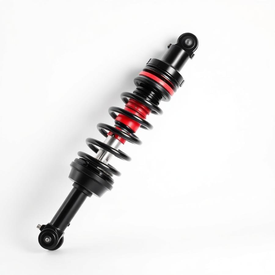
Square image, brand eyebrow, two-line title, fitment line, rating, price with strike-through, stock pill and full-width add-to-cart.
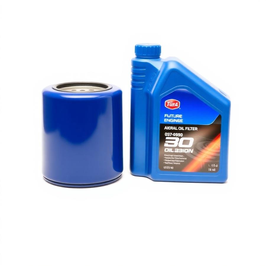
Bosch
Fits: Toyota Hilux 2.8 GD-6 · 2016–2024
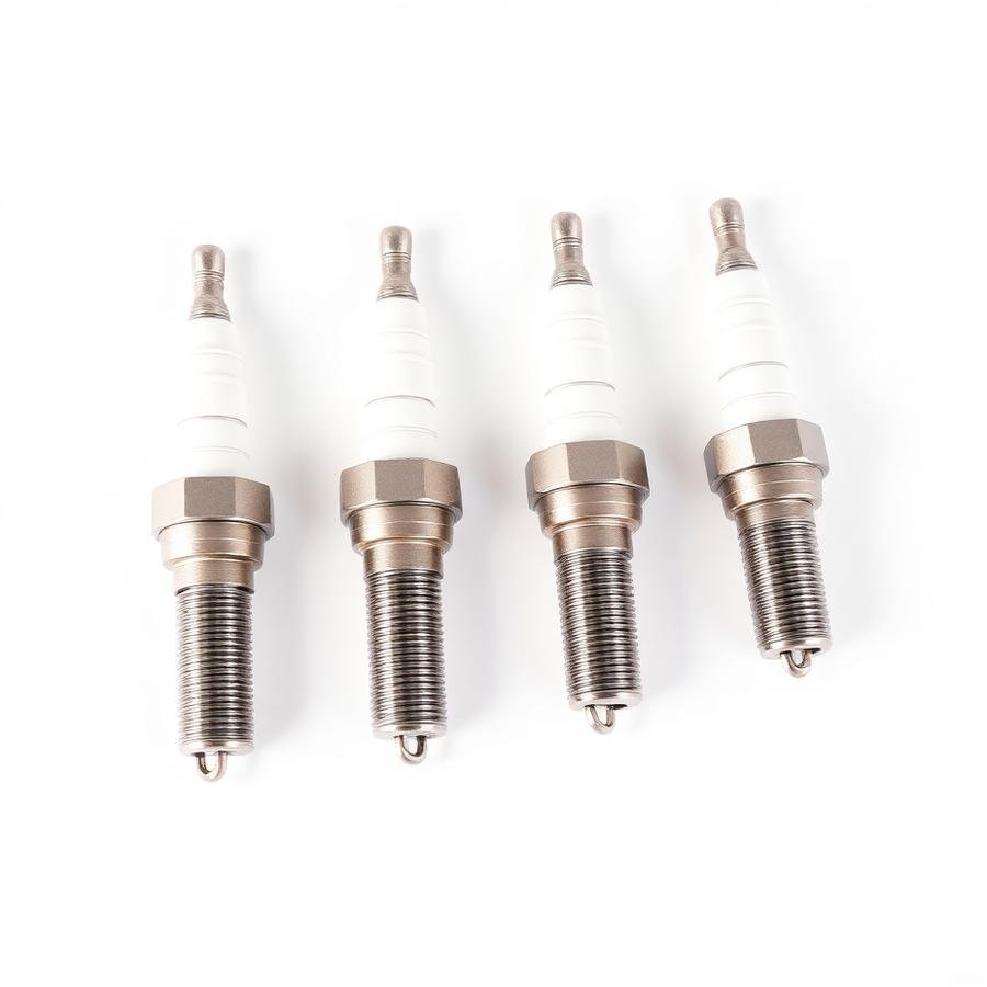
NGK
Fits: Ford Ranger 2.2 TDCi · 2012–2019
10 — Icons
Single stroke family at 1.75px weight, 20/24px sizes, always paired with a text label for accessibility.
11 — Modals, dropdowns & filters
All three are live — click through them. Built as Spectra modal, Astra dropdown and a WooCommerce widget filter rail.
Centered, 24px radius, dimmed backdrop, dismiss on backdrop or ✕.
Sort control used above every grid.
Brand facet with live chips.
12 — Wireframes
Block order per template, expressed in 12-column spans so it drops straight into Spectra containers.
Home
Shop / Category
Product
Checkout
13 — High-fidelity mockups
Each mockup is a working page — the same components, tokens and grid documented above.
14 — Prototype
Primary journeys wired end-to-end. Follow any flow in the live site — every link in this prototype resolves.
Home → Vehicle Finder → filtered Category results
Category → Filters (brand / price / stock) → Product
Product → Fitment confirmed → Add to cart → Mini-cart drawer
Mini-cart → Checkout → PayFast → Order confirmation
Header search → Suggestions dropdown → Product
Request a Part → VIN + photo upload → WhatsApp follow-up
15 — Sticky header & dark footer
Both are live on every page of this build — scroll to see the header stick and the dark footer close the page.